Why every note has a colour
We put a colour on every perfume note we publish. Until now we had never explained why that is a defensible thing to do. Charles Spence at Oxford has spent a career on exactly this question, and his review of the field is the closest thing to a test our palette has. It is a stress test rather than a validation: it cannot confirm an ingredient-by-ingredient system, and it has barely looked at the direction we use. This page is what happened when we ran our palette past it anyway.
On this page
The research
Olfactory-colour crossmodal correspondences in art, science, and design is by Charles Spence, of the Department of Experimental Psychology at the University of Oxford. It is open access, so you can read the whole thing.
It is not one experiment. It is a review of everything the field has established, pulling together more than 20 peer-reviewed studies going back to 1931. It sets them out in a single table: how many people took part, how many colours they got to choose from, how many smells, and which country they were in. That makes it the right thing to check ourselves against, because no single study would be.
The headline is that this is real, with a caveat that runs through the whole review. People who are not synaesthetes do not pick colours for smells at random, and some matches recur across countries and ages. But which colour, and how much agreement there is, moves with the smell, the method and who was asked. Colouring a smell is not a party trick, and it is not a constant either.
Why colouring a note works at all
The useful part for us is not that colour-smell links exist. It is why they exist, because there is more than one reason and they are not equally solid.
Spence's table marks each study for whether it shows source matching, which he defines as the colour-smell link being carried by specific object associations. In plain terms: people say lemon is yellow because lemons are yellow. They have seen a lot of lemons.
That is what we do, though we should be clear it is one of several explanations Spence sets out, not the settled one. We colour the ingredient by what the ingredient looks like. We are not claiming that some abstract law of the mind links a wavelength to a smell. We are relying on the plainest and best-evidenced mechanism in the review, and it happens to be the one that survives contact with a real catalogue of real ingredients.
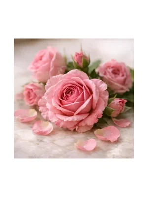
One thing we do differently is granularity. Most of the studies work at the level of a scent family. We colour every ingredient separately, which is why our Rose is magenta while our Jasmine is very nearly white. Both are florals. Roses and jasmine flowers are not the same colour, so neither are ours.
A rough comparison with a 1978 survey
The review describes a survey by Déribéré that sent out 3,000 questionnaires and got around 1,000 usable replies, ending with a plain list of which colours people put with which smells. It covers seven broad classes of odour, not individual perfume notes, so lining it up against our palette means picking one of our notes to stand for each class. That is a rough comparison rather than a test, and the substitution is ours: he said "floral" and we are answering with rose.
| His odour class | Colours his respondents gave | The note we answer with |
|---|---|---|
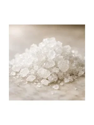
| Camphor | White or light yellow |
 Camphor
#5CD6C6
|
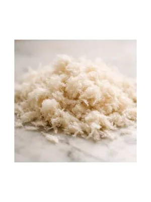
| Musk | Red-brown or golden brown |
 Musk
Musk
#D6D3D1
|
| Floral | Rose |
 Rose
Rose
#E61980
|
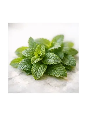
| Mint | Green |
 Mint
Mint
#30C08B
|
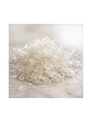
| Ethereal | White or light blue |
 Aldehydes
#EDEDED
|
Scroll the table sideways to see every column
His other two classes, acrid and putrid, are missing here because we hold no note that stands for either without stretching, and inventing one to fill the row would be the same mistake as scoring the table.
Rose, mint and aldehydes land where his respondents did. Camphor and musk do not, and the two misses fail for different reasons, which is the interesting bit.
Musk is the clean case. We colour it as the pale modern material perfumery uses now; his respondents were more likely picturing the dark animal original. Neither of us is wrong about the colour. We disagreed about the object, and that is a real limit of source matching rather than a bug in our palette, so we have left ours alone and written it down here instead.
Camphor is the awkward one, because it is not source matching at all. Our camphor is a cool cyan, which is nobody's idea of what the plant or the crystal looks like. It is coloured for the sensation - the cold, mentholic hit - and that is a different rule quietly applied to one note. His respondents said white or light yellow, which is the actual colour of the actual crystal. On this one he followed our stated method more faithfully than we did.
Four colours the research cannot check
In 2026 our note model added four descriptors it had been folding into their neighbours: sour, lactonic, sulphurous and mineral. Each needed a colour, so we picked one the way this page argues for, by picturing the material. Then we went looking for what the research said about them, and found that it says nothing. Spence's review does not test any of these four as odour descriptors.
| New descriptor | What we assigned | What we were picturing |
|---|---|---|
| Sour | #D4E157, a sharp yellow-green |
Vinegar, tart fruit, ferment. Unripe rather than ripe |
| Sulphurous | #C0CA33, a dense chartreuse |
Garlic, onion, the blackcurrant thiol. The element itself is yellow |
| Lactonic | #F5E1C0, cream |
Butter, milk, coconut |
| Mineral | #7D8A8C, a cold grey |
Flint, chalk, wet stone. A referent with almost no colour of its own |
So this is four colours chosen by the method and left unchecked, which is worth saying plainly on a page about checking. The one piece of evidence that comes anywhere near is not encouraging: among the counter-intuitive matches Spence lists is the smell of vinegar going with pink, from a 2012 study by Stevenson and colleagues. Not yellow-green. One study, one odorant, and not a test of "sour" as a descriptor - but it is a reminder that source matching is a reasonable rule rather than a reliable one.
Colour on its own is not enough
Spence concludes that where cultural or personal differences get in the way, the translation from colour to smell "is unlikely to succeed, or will need further constraining by the use of text or imagery".
That is the third time we have hit the same wall from a different direction. The usability research we built our evolution timeline on found that word anchors beat pure abstraction. The study of AI-generated scent images found that an abstract picture with no description attached was the worst-scoring option of the seven they tested. Now a review of ninety years of colour research says colour will need words alongside it.
Three separate fields, three separate methods, and each in its own way says the same thing: a colour is a way in, never the whole message. It is why every note on this site is named next to its colour, on the note chip, on the smellmap and in the timeline. We have never shipped a colour on its own and now we have a good reason not to start.
Where the research does not back us up
This is the part that matters, and it is not comfortable. Almost every study in the review handed someone a smell and asked them to pick a colour. We do the opposite. We hand you a colour and hope it tells you something about a smell.
Spence is direct about this. He notes that people describe smells by naming the thing they come from, and that they struggle to name even familiar smells out of context. He concludes that "the bidirectionality of this class of crossmodal correspondence should not be assumed". He also points out that designers are usually interested in the reverse direction while the researchers have mostly tested the forward one.
- Smell to colour Ninety years of studies. This is what the review covers
- Colour to smell Barely tested. This is the direction our interface uses
So the honest position is this. The direction that has been tested for ninety years is smell to colour. The direction we use every day is colour to smell, and on Spence's 2020 account of the field it had not been properly tested by anyone. We are the designers he is describing.
Two smaller cautions we have taken on board as well. The colours people map to smells never show perfect agreement, even in the best cases, and the same smell can get a different but equally consistent colour in a different culture. And a consensus in a study does not mean people found the task easy. Spence notes that participants often report finding it hard and intuitive at the same time. So we treat our palette as a helpful convention, not as a fact about the world.
The trap of making it pretty
One more warning from the review that lands squarely on our own visual work. Spence observes that as soon as colours and forms get combined into a designed composition, the viewer's attention can switch to judging the composition itself. Those judgements of visual harmony are then "in danger of dominating over crossmodal judgments of correspondence".
In other words, a good-looking ScentArt canvas is not evidence that it communicates the fragrance accurately, and it may make you read it as a picture rather than as information about a smell. We have not solved that. We keep the note names on the image and the note list beside it, so there is always something to read as well as something to look at. Spence does not show that the effect grows with prettiness, and neither do we - the point is that looking good and working are separate questions.
The palette on this page is the one every renderer dyes its notes with, so it is the part of ScentArt that has never been replaced. The pictures around it have, eleven times - the renderers walks through each one from the first dots on a flow field to the current material engine, and every one can be opened on any perfume to see the same colours put to a different use.
Every note we hold has a page carrying its picture and the colour we store for it - browse them in the note catalogue.