Why we show a picture of the raw ingredient
Look at a picture of a cut lemon and you will half-smell it. Two marketing researchers ran eleven studies to show that this is real, that it changes what people choose, and that it can be got wrong in three specific ways. We show a picture of the raw ingredient next to almost every note we hold, so this is a test of something we already do. We pass one part of it and fail another.
On this page
The research
Seeing is Smelling: Pictures improve product evaluations by evoking olfactory imagery is by Varun Sharma of Carnegie Mellon University in Qatar and Zachary Estes of Bayes Business School, City St George's, University of London. It was published in the International Journal of Research in Marketing in 2024. There is a free copy if you want to read it.
The problem they set out to solve is one we have too. Smell sells things, but you cannot put a smell in a web page. Their answer is that a picture of the scented thing makes people imagine the smell, and that the imagined smell shifts how they rate the product. Not that it stands in for smelling it - they did not test that, and it is not what we are claiming here.
They ran seven main studies and four more besides. Three results carry the whole argument:
- A picture beats no picture. With a photograph of the scented object, people's rated sense of smelling it went from 2.68 to 3.90, and their opinion of the product went from 3.09 to 3.51. Both differences were solid.
- A scented thing beats an equally pretty unscented one. 62% preferred an advert showing a rose over the same advert showing a sunflower. Roses smell. Sunflowers largely do not. Prettiness alone does not explain the gap.
- A cut lemon beats a whole lemon. 71% preferred the label with cut lemons on it. Cutting it open makes the smell easier to imagine, and that is the whole mechanism in one picture.
What it backs up
We already put a picture of the raw ingredient next to every note that has one, on the note page, in the drydown timeline and in the "what it smells like" row. We did that because Kateřina Milatová's usability work found notes shown as an image plus a word were rated 1.7 times more helpful than the same notes as a plain list. This is the same answer arrived at from a completely different direction, with eleven studies and real product choices behind it.
Two of their conditions also happen to point our way. The effect is stronger in people who care more about smell, and our readers have gone out of their way to visit a site about how things smell. And it only improves how a product is rated where scent is a relevant attribute, which for perfume it plainly is.
What our pictures actually are
They are not photographs, and we should say so plainly on a page that argues for them. Each one is generated by an image model from a written instruction asking for a photorealistic shot of that ingredient in its raw form.
That instruction is no longer ours to change. Note art moved upstream in August 2026 to ScentPrism, the standard our note vocabulary comes from, and every note picture on the site today is published from a ScentPrism release rather than generated here. The wording is the same one we wrote. The ownership is not.
We think that is a defensible use of a model, and a different thing from asking one what a smell looks like. Drawing a lemon is a solved problem - the model has seen plenty of lemons, and so has the reader. What it is never asked is what an ingredient smells of, or what colour or mood to give it. Those come from our own data. Our page on AI-generated scent images is about what happens when a model is asked that harder question. The short version is that it gets it wrong in ways a reader would have no way of catching.
The instruction being written down rather than lost inside the picture is what makes the next section possible. We can ask what is being requested across the whole catalogue and get a straight answer, even when the answer is not the one we wanted.
The bit we have not done yet
Here is where we come off worse, and we would rather say it than not.
Their cut-lemon finding is a straightforward instruction: show the ingredient in whatever state makes its smell easiest to imagine. So we went and checked what is asked for. Every one of the 1,337 note instructions we hold a copy of uses the same wording, asking for the ingredient "in its natural raw form". Not one asks for it cut, split or opened; where "freshly cut" appears at all it is describing the smell, not the picture.
So on their evidence, wherever cutting would help, we have been showing the whole thing. A whole vanilla pod is a brown stick. A split one smells unmistakably of vanilla. We have been showing the stick.
We have not fixed this, and it is no longer ours to fix on our own. The instruction lives in ScentPrism now, so the change has to happen upstream and arrive in a release. What we have done is the part we can: worked out which ingredients it should apply to. "Cut it open" is good advice for a lemon, better for a cardamom pod, and meaningless for a synthetic molecule, so it is not a find-and-replace. Of the 1,744 notes carrying a picture, 371 have a form worth changing - fruit cut to the flesh, citrus halved, pods split, wood shown end-grain - and the other 1,373 are better as they are. That list has gone upstream. When it lands we will come back and change this section, rather than quietly leave it reading as though we were always doing it right.
Six notes worth looking at again
Their third condition is the one that reverses. Pictures of bad-smelling things make people think worse of a product, not better. They found brands advertising odour removers by showing the odour, and showed it backfiring.
Perfume has ingredients like that. Some of the most valuable materials in perfumery are, on their own, unpleasant, and only become beautiful once they are diluted into something else. Six clear examples in our catalogue carry pictures: Civet, Castoreum, Hyraceum, Indole, Ambergris and the catch-all Animalic.
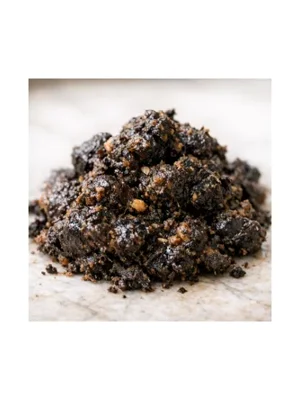
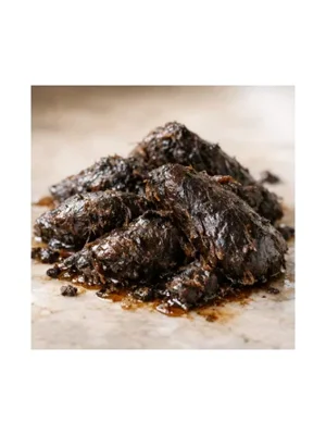
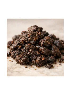
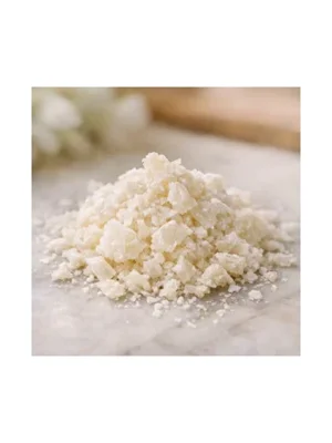
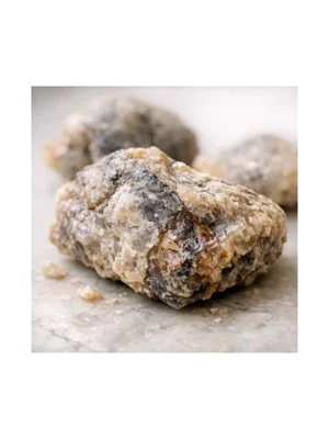
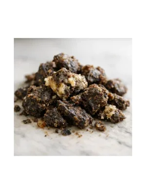
We are not going to pretend we know the answer. A lump of ambergris on a beach looks like a grey rock and probably does no harm at all. Others might. The right response is to look at the six actual pictures and decide one at a time, which is what we are going to do. It is a question we would never have thought to ask.
The finding we are not chasing
One thing needs saying plainly, because this paper is not written for us. It is written for people selling things, and what it measures is whether you like a product more and whether you pick it off the shelf. Its closing advice is about designing packaging to improve how a product is rated.
On the page next to this one we wrote that we would rather be trusted than convincing, because Milatová found that vivid scent visuals raise a buyer's confidence without reliably raising their accuracy. Read carelessly, this research is a manual for exactly that mistake.
We are taking the cut-open finding because it makes a picture more informative: a split vanilla pod tells you more about the smell than a whole one does. We are not taking anything on the grounds that it makes people like us more. "It improves evaluations" is not a reason we accept on its own, and this is the paper where that distinction has to be made carefully.
See it
Six notes that carry the argument, including the awkward ones. Every picture here is the raw, uncut form. For some of them that is the thing this page says should change; for others, cutting would tell you nothing.
- Lemon - the paper's own example, and still whole in ours
- Rose - the flower they showed beat an equally pretty sunflower
- Vanilla - the split pod is the recognisable one, not the stick
- Cardamom - same again, the scent is inside the pod
- Oud - where "cut it open" stops meaning anything useful
- Ambergris - one of the six we need to look at again
Every published note we hold has a page - browse them all in the note catalogue.